Capturing the Emotion in ‘Shrinking’: Production Designer Cabot McMullen Talks Set Design
Shrinking stars Jason Segel as Jimmy Laird, a therapist whose wife recently died. To cope with his loss, Jimmy forgoes his training and ethics and takes an unconventional approach to therapy. The Apple TV+ series delivers a lot of emotion in each episode’s 20-30 minute run time. Part of that emotion is evoked through Shrinking‘s set design.
The seriess takes place in Pasadena, California. So, that’s where production spent a lot of time filming the characters’ homes and the therapy offices. Showbiz Cheat Sheet spoke with production designer Cabot McMullen to get more detail about why Pasadena was the perfect backdrop. McMullen also spoke about collaborating with Segel and the rest of the cast on set design decisions for Shrinking.

‘Fifty Shrinks’ book inspired the therapy offices in Apple TV+’s ‘Shrinking’
The therapy offices where Jimmy, Paul (Harrison Ford), and Gaby (Jessica Williams) work were designed on a sound stage. McMullen collaborated with the actors on each office’s design to capture character-driven representation. They achieved this through artwork, books, color palettes, and desktop details like Gaby’s lamp scrunchies.
“The cast were each valuable partners in helping us fine-tune the look of their individual offices,” McMullen tells Showbiz via email. “We started out referencing the photo book Fifty Shrinks, which helped us understand what drives a therapist’s choices when creating their office.” McMullen says most of the time, therapy offices are meant to “provoke a response in the patient.”
Jason Segel, Harrison Ford, and Jessica Williams chose accessories for their offices in ‘Shrinking’
“Our brilliant set decorator, Andrea Fenton, curated the collection of fixtures, finishes, and furnishings you now see on the show,” McMullen adds. “Each cast was very pleased and complimentary when they first saw their sets.”
Still, the cast of Shrinking contributed personal character details that would help with their performance in the Apple TV+ series. “Harrison Ford had recently met with Phil Stutz, the therapist who inspired his character, Paul,” McMullen said. “He was excited to share many valuable details drawn from Mr. Stutz’s real-life routines at work and some physical workarounds he devised to alleviate some of his Parkinson’s symptoms.”

Williams and Segel had input about their character’s offices, too. “Jessica Williams had many great ideas for her room about color, books, and art by respected African American artists, toys for her desk, and a foot massager …,” McMullen explains. All of the details — down to the plants in Jimmy’s office — help capture each character’s personality. McMullen adds: “Jason Segel had great ideas about his choice of devices and the plants in his office, all to telegraph that Jimmy is neglecting himself and every living thing around him, hence his dead plants in the room.”
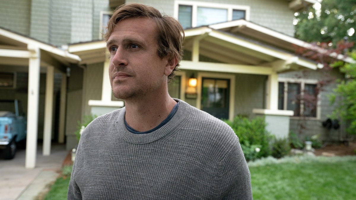
Jimmy’s Craftsman-style home in Pasadena symbolizes the ‘darkness he emerges from’
Jimmy and his grief are the central focus in Shrinking. Segel’s portrayal captures all of the emotions that come with that experience, but so do the sets and color story used in the Brett Goldstein and Bill Lawrence-produced series.
Jimmy lives in a mid-century modern renovated Craftsman-style house. McMullen designed the home with warm, gold tones and splashes of navy blue throughout. This color story reflects Jimmy’s journey of self-growth.
At first, the house appears dark and gloomy. Designers used low lighting and kept the shades drawn to capture that feeling. Throughout the series, Jimmy’s house starts to become brighter. Fans will notice splashes of color with each episode.
“After discussions with Neil Goldman [Shrinking‘s head writer], director James Pondsolt, producer and director Randall Winston, and executive producer Jason Segel, the idea emerged that we should first find Jimmy grieving at home, shutting out the world with the drapes closed and not taking good care of himself or [his daughter] Alice [Lukita Maxwell],” McMullen says. “We would treat it like a 5-hour movie about a man who slowly emerges from that darkness into the light over 10 episodes. For that and many other reasons, we all agreed a Craftsman-style house would be ideal for Jimmy’s home. So that became the stylistic target for the exteriors.”
The style of the house was only one aspect. Next came making the house feel like a home. Jimmy’s love for music and art was another aspect McMullen worked to highlight in the Pasadena home. To capture that dimension of Segel’s character, McMullen worked with local Pasadena artists and musicians. Their work is displayed throughout Jimmy’s house in Shrinking.
Watch Shrinking Fridays on Apple TV+ to notice these set design details and more.


