Ina Garten Reveals the 1 Thing She Will Never Have in Her Kitchen
Ina Garten is a big fan of keeping her recipes simple and she follows that same simplicity with her kitchen design. The Barefoot Contessa star’s kitchen isn’t cluttered, though she has many things easily accessible on her counter. Find out the one thing Garten said she’ll never have in her kitchen.

Ina Garten reveals she’ll never have 1 item in her kitchen
During a 2009 interview with House Beautiful, Garten shared some of the elements of her kitchen design, including the ways she organizes her space.
Among her many tips was a rule to keep everything organized for easy access. “I think particularly, if things aren’t stacked on everything else, it’s so much easier to cook,” she shared.
“Another thing I do is I have things out a lot. I don’t put my Kitchen Aid mixer away — I leave it on the counter,” Garten continued.
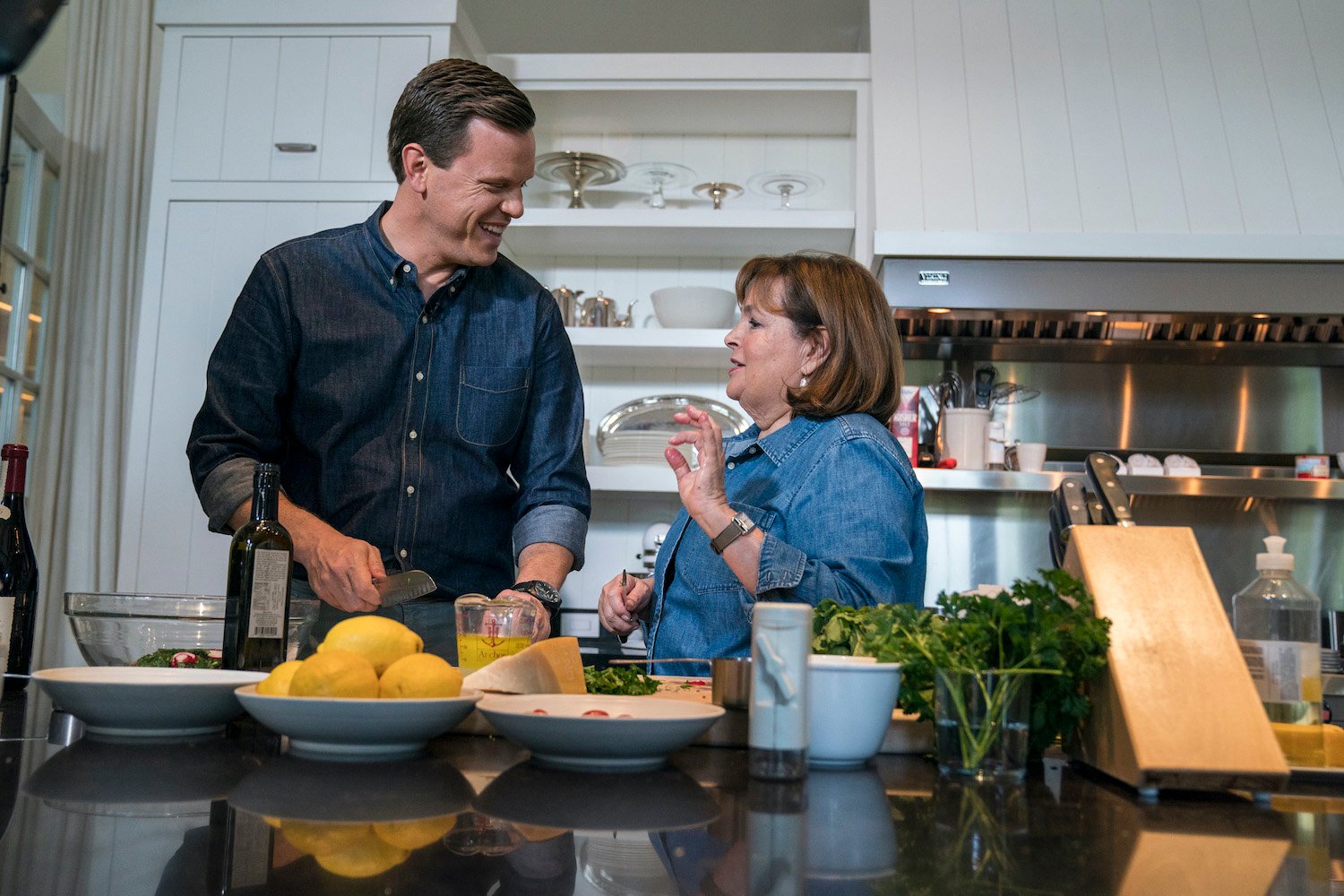
Garten also shared that she keeps the color scheme simple. “Everything’s white … they all go together, stainless steel and white,” she explained. “And I have big jars with all your equipment in it — whisks and spatulas and things — which can look messy, but I have all the metal things in one jar and I have all the white and wood things in another jar, so it looks neat. It looks orderly.”
Garten shared that you’re never going to find anything flashy in the midst of her kitchen, however. “I think it looks orderly particularly because it’s only stainless steel and white,” she noted. “That’s it. There aren’t like hot pink spatulas in my kitchen.”
“And there never will be,” Garten added.
Ina Garten has the perfect kitchen paint color to make her recipes pop
Garten also shared why she likes a subdued kitchen paint color that is the perfect pairing with her recipes.
“Most people start with the design of something but I want to know what color the room’s going to be first,” Garten said. “For a kitchen, because you’re dealing with very brightly colored things, I want something that’s a great foil for the colors of the fruits and vegetables.”
“So in my kitchen in my house, it was for a long time sage green stripes and black and white tile,” she continued. “It was a great backdrop for color. So when you bring in a pumpkin, it really punches.”
Garten designed the magazine’s 2009 Kitchen of the Year that was on display in Rockefeller Center and selected Glidden’s Wood Smoke for the wall color. “In the Kitchen of the Year, what we did was my favorite color … it’s like a taupe-y gray and so that’s what the walls are,” Garten explained.
“And it really makes the colors of the fruits and vegetables pop,” she added. “The countertop is a really dark gray which is a great color for making whatever you’re working with. If there are bowls of lemons or bowls of lime, it makes that look fantastic.”
Her reason for the neutral color choice is that it allows the food to be center stage. “I don’t want them competing,” she noted. “If the room is like bright red, then you’re aware of the room, you’re not aware of what’s in it.”


