The Led Zeppelin Album Cover Jimmy Page Disliked Almost as Much as ‘Led Zeppelin III’
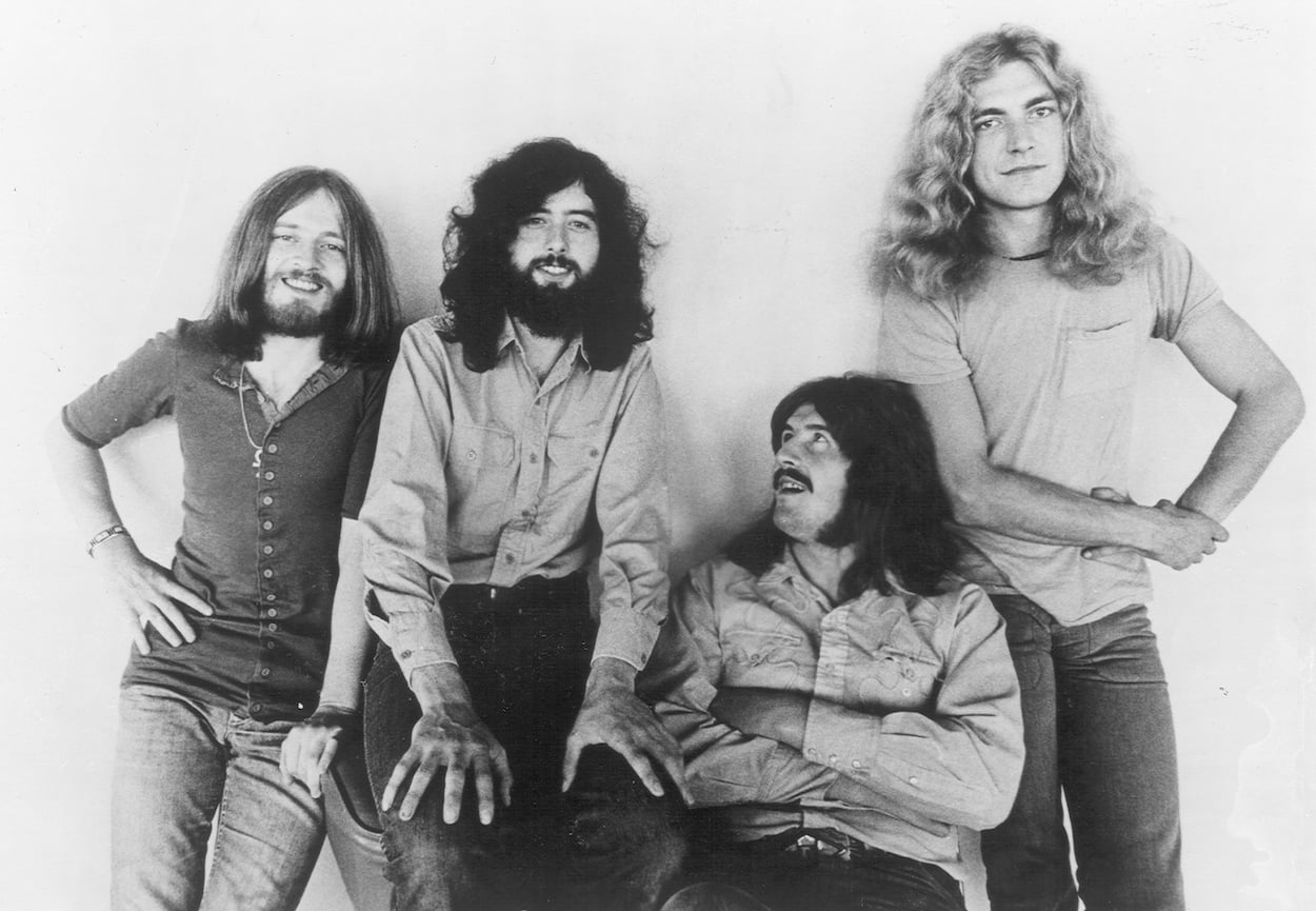
It took all four members of Led Zeppelin to make the band legendary, but Jimmy Page was the mastermind. He formed the band, wrote almost all of the music, and played blistering solos that earned adoration worldwide (even if one Zeppelin concert was torture for another famous guitarist). As the band’s producer, Page had a lot of say about how the albums sounded, and he also took an interest in how they looked. He wasn’t a fan of the sleeve for Led Zeppelin III. There was another Zeppelin album cover Page disliked almost as much.
Jimmy Page was no fan of the cover of ‘Led Zeppelin III’
After two hard-hitting and heavy blues-influenced albums, Led Zeppelin III confused fans and critics with several folk-inspired songs. The cover telegraphed the musical direction even before listeners dropped the needle onto the vinyl.
Gone were the burning blimps from the first two albums and the band’s name written in blocky letters. In their place was a clip-art collage of random images and “Led Zeppelin” written in a rounded, bubbly font. The cover for Led Zeppelin III included a spinning wheel that would display different images in cut-outs on the jacket when you rotated it.
Zep created an instantly recognizable jacket, but Page didn’t like the Led Zeppelin III cover. He called it teeny-bopperish. But because the artist handed over the artwork just before the final deadline, Page and Led Zeppelin had no chance to make any major changes.
Page disliked another Led Zeppelin cover that hit shelves a few years later. He dismissed the first cover idea, but even that couldn’t prevent what ended up being a jacket he didn’t like.
Page moved on from the first artist who worked on the ‘Houses of the Holy’ cover, but he still disliked the finished product
The London-based design firm Hipgnosis created some of the most recognizable album covers ever. It designed nearly all of Pink Floyd’s album sleeves (including Dark Side of the Moon). Hipgnosis worked with Led Zeppelin multiple times, even after its Houses of the Holy cover Page disliked.
The guitarist had little recourse when it came to the Houses of the Holy cover. The band was up against a deadline to hand in the album, writes George Case in Led Zeppelin FAQ.
“When the proofs for the album came back, they didn’t look anything like the original artwork. Again, we were on a deadline, and there wasn’t much to be done. I suppose it doesn’t matter now.”
Jimmy Pages describes why he disliked the Houses of the Holy album cover
Hipgnosis founder Storm Thorgerson initially proposed an image of a tennis racket, which Page took as the artist implying Led Zeppelin’s music was a bunch of noise — a racket. He quickly moved on from Thorgerson. “We never saw him again,” Page said, per Led Zeppelin FAQ. “He had some balls! Imagine — on a first meeting with a client.”
The band was more receptive to Aubrey Powell’s idea for a photographic cover. Powell used the Giants Causeway rock formation in Northern Ireland as the setting. The sky’s glowing orange hue came courtesy of airbrush paint on the image.
Powell’s jacket idea appealed to the guitarist more than Thorgerson’s, but Page wasn’t a huge fan of the House of the Holy cover. Page disliked the finished product, but it might be Led Zeppelin’s most recognizable album cover.
The ‘Houses of the Holy’ cover stands out among Led Zeppelin albums

Page wasn’t a huge fan of the final Houses of the Holy cover, but that doesn’t change the fact it remains one of rock and roll’s most immediately identifiable jackets.
The otherworldly setting is unlike anything else in their catalog. Add in the bright orange hues and the nudity, and the Houses of the Holy cover jumps out at you. Whether or not you know it’s Led Zeppelin, you almost can’t help but pause to look at it. That’s an impressive feat for an album from 1973.
Led Zeppelin III had a busy cover that Page hated. The sleeves for Physical Graffiti and Presence also made artistic statements beyond the music. Jimmy Page disliked the Houses of the Holy cover, but it might be the standout among all Led Zeppelin jackets.
For more on the entertainment world and exclusive interviews, subscribe to Showbiz Cheat Sheet’s YouTube channel.