Matthew McConaughey and Kate Chastain From ‘Below Deck’ Both Share a Common Love of Fonts
Actor Matthew McConaughey and Kate Chastain From Below Deck both have a serious affinity for fonts with McConaughey recently referring to himself as a “font nerd.”

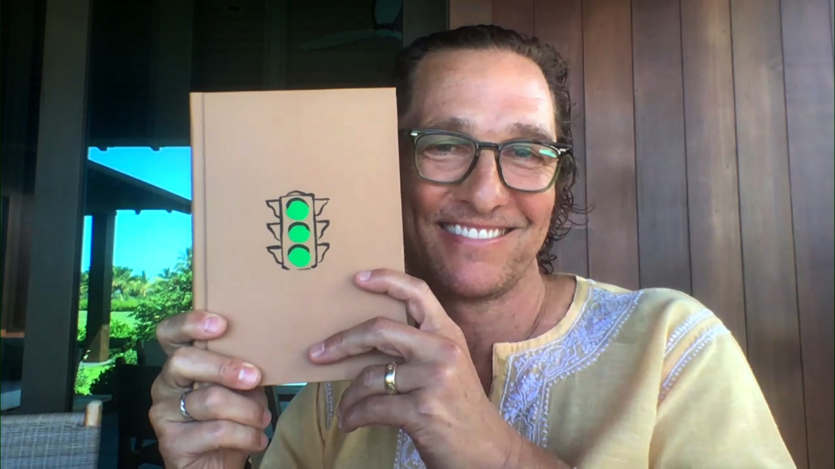
McConaughey appeared on Watch What Happens Live with Andy Cohen when host Andy Cohen noted that the print in his book, “Greenlights” was especially small. “That’s an artistic choice that I have to assume you were behind,” Cohen asked during the After Show. “And publishers sometimes aren’t into that. Was that tough for you to push that through?”
“It wasn’t so much tough about the size,” McConaughey said. “But I am a big font nerd. I love fonts. So I went through all these fonts and I have about six different types of fonts that are deliberately put in different places through the book. But fonts are what I really pushed hard on. The size, that was an easy discussion on that one.”
Fonts are like someone’s personality
Chastain assigned specific fonts to each crew member’s personality since she started on the series. She typically revealed her font choices in a confessional and would often give a small explanation as to why she chose the font for the crew member.
“You know everybody’s personality is different,” she said in a confessional during season 2. “Everybody’s got their own kind of font.” She says she is Times New Roman. “It’s classic, it’s the traditional standard,” she said. ‘It’s assertive, professional.”
She then moves onto bubbly second stew Amy Johnson. “Amy is Comic Sans,” Chastain observed. “It’s cheerful, it’s casual. Nobody really takes it too seriously.” She assigned Wing Dings to third stew Kat Held. Held was a cast member who just wanted to have fun, but still did her job. “Kind of random and quirky,” Chastain said. “You just never know what’s gonna happen when you press a button.”
Kate Chastain then moves on to assign fonts to the chef and deck team
Chastain then moves onto assigning chef Ben Robinson a font. Season 2 was her first season working with Robinson and the two would eventually form a close friendship bond. “Chef Ben, Informal Roman in italic,” she shared. “It’s got formal roots. But it still kinda has its own not so formal way about it.”
“Kelley’s [Johnson] Broadway,” Chastain said. “Because dancing performers who love the spotlight.” Deckhand Logan Reese, who replaced outgoing deckhand Andrew Sturby was assigned Tahoma. Chastain said he received that font because “It sounds like Oklahoma and it’s kinda sexy.”
Deckhand Jennice Ontiveros gets Papyrus. “It’s organic, it’s earthy and it has its roots in an ancient civilization,” Chastain said.
She also went beyond the Below Deck family and assigned fonts to The Real Housewives of New York City. She also assigned a font to Andy Cohen. “@Andy = ‘New Century Gothic’…..A.k.a. The Pop culture tastemaker of New York,” she tweeted.


