The NYC Building Led Zeppelin Used on the ‘Physical Graffiti’ Cover Is Still There
You can’t talk about 1970s American culture without talking about New York’s East Village. At the Palladium (on the neighborhood’s border at 14th Street), music fans could catch shows by The Ramones, Iggy Pop, and Bruce Springsteen.
And if you hung a right on Third Avenue and kept going (past Taxi Driver film locations) on Bowery (past 4th Street), you’d come across CBGB at Bleecker. That’s where acts like Blondie, The Damned, The Misfits, and Talking Heads gained traction.
You won’t find these landmarks around these days. The Palladium closed in the late ’90s to become an NYU dorm. And after shuttering in 2006, CBGB became a John Varvatos boutique. That’s been the story of the neighborhood in recent decades.
Not everything’s gone, however. Led Zeppelin fans can at least find the building(s) that graced the cover of Physical Graffiti on St. Mark’s Place just east of First Avenue.
The tenements of ‘Physical Graffiti’ still stand on St. Mark’s

While Coney Island High is long gone from St. Mark’s, a trip down the storied East Village street does deliver one clear picture of rock history. Between First Avenue and Avenue A (on the south side of St. Mark’s), you’ll find the pair of tenements Zep used for the cover art to their sixth album.
Indeed, the millions of fans who heard Jimmy Page and company mesmerize on “Kashmir” and “Ten Years Gone” were staring at a cover of (for the time) fairly common neighborhood buildings. The address is 96-98 St. Mark’s Place.
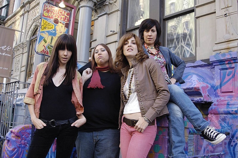
When the all-ladies tribute band Lez Zeppelin posed there in the early ’00s (photo above), passers-by would get confirmation of the building’s history in the name of the vintage-clothing store just below ground level.
While that vintage shop closed and moved on years ago, you will still find a Zep reference in a newer establishment, “Physical Graffitea.” But the “bones” of the building (like so many other in the Village) must have been good enough to keep the landlords in business all these decades.
Zeppelin spent a fortune on the ‘Physical Graffiti’ cover

If you’ve been baffled by Zep’s choice of album covers over the years, we don’t blame you. While the band’s debut record and crushing follow-up (Led Zeppelin II) had comprehensible covers, things took a bizarre turn with the third album.
On Led Zeppelin III, the pop-art cover featured drawings of butterflies, zeppelins, birds, and anything else you might imagine. But III did hint at the direction the band later took on Physical Graffiti in the cut-out circles that featured more drawings underneath.
For Physical Graffiti, the cover once again featured cut-outs (in this case, using the tenement windows) that the sleeve would fill in with the letters of the title. Peter Corriston, the artist behind it, made the letters match the windows by chopping off the building’s fourth floor.
Those who own the 12-inch record know that the fun only begins there. The two album sleeves inside allow you to match whichever side you like into the spaces on the cover. (Photos and/or drawings of Zep members in drag, Lee Harvey Oswald, and King Kong are among the options.)
If that sounds like a grand, expensive project for artists, photographers, illustrators, and designers to undertake, it was. At the time, no one had ever spent as much on the design of an album cover. As Zep acknowledged, their default mode was always somewhere between “bigger” and “biggest.”
Also see: The Led Zeppelin Masterpiece Robert Plant Wrote in a Wheelchair


